Introducing the Responsive Image Debugger: Making Drupal’s Responsive Images Easier to Debug

Table of Contents:
At iTech4Web, we build and maintain complex Drupal websites for media publishers, nonprofits, and enterprise clients. In doing so, we often rely on Drupal’s powerful built-in responsive image handling system to deliver optimized images for different screen sizes and resolutions. But when something goes wrong—like the wrong image style loading, breakpoints behaving unexpectedly, or performance bottlenecks from oversized images—debugging can be a frustrating, time-consuming process. That’s exactly why we built the Responsive Image Debugger module. This lightweight module is designed to help developers, themers, and QA teams easily debug responsive image issues on Drupal websites. It’s simple, non-intrusive, and invaluable when you’re trying to figure out which image is being served and why. Let’s dive into what the module does, why we created it, and how it can improve your workflow.
That’s exactly why we built the Responsive Image Debugger module.

This lightweight module is designed to help developers, themers, and QA teams easily debug responsive image issues on Drupal websites. It’s simple, non-intrusive, and invaluable when you’re trying to figure out which image is being served and why.
Let’s dive into what the module does, why we created it, and how it can improve your workflow.
The Problem with Debugging Responsive Images
Drupal’s Responsive Image module allows site builders to define responsive image styles mapped to breakpoints—an essential feature for modern performance-optimized websites. However, the complexity of the setup (image styles + breakpoints + media queries + theme layer logic) can make it difficult to debug which image style is being served at which viewport width.
Some of the common challenges we’ve encountered include:
- Images not appearing correctly on specific screen sizes.
- Wrong image styles being applied.
- Oversized images affecting performance.
- Unclear mapping between image tags and their corresponding breakpoints or image styles.
- Needing to manually inspect srcset and guess which image was rendered.
When dealing with these issues, the only tools available were the browser inspector and a lot of trial and error. We needed a better way.
Back to topWhy We Developed the Responsive Image Debugger
This module was born out of real-world needs from our development and QA teams. We work with large-scale sites where image performance is critical. In some cases, editors would upload very large images, and even though responsive image styles were in place, we couldn’t easily verify which derivative was loaded under which conditions. QA teams had to rely on visual guesses and inspect element—wasting precious time.
So we decided to automate that insight.
- With responsive_image_debugger, we wanted to:
- Make it immediately visible which image style is being rendered on the page.
- Highlight whether the image is being scaled up or down from its original size.
- Display detailed image metadata directly on the page in a visually accessible way.
- Allow debugging mode to be restricted to certain user roles to avoid showing info to regular visitors.
Key Features of the Responsive Image Debugger
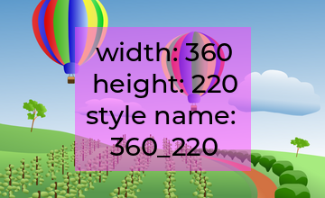
Once enabled, the module overlays helpful information directly on top of responsive images rendered via Drupal’s responsive_image field formatter. Here’s what it adds:
✅ Image Style Info
Shows the name of the image style used for the currently loaded image in the src attribute of the <img> tag. You’ll know immediately whether thumbnail, medium, large, or a custom image style was applied.
✅ Image Size and Scaling Warning
Displays the original image dimensions and the actual rendered dimensions. If the image is being scaled up beyond its original size (which can lead to blurriness), the module displays a clear warning so you can take action. (In progress)
✅ Breakpoint Info
If breakpoints are defined, the module shows which breakpoint condition matched and which image file was selected from the srcset. (In progress)
✅ Overlay on Hover or Persistent
You can choose whether the debugging info shows on image hover or is always visible—helpful for comparing many images across a page. (Right now it is always visible, hover in progress)
✅ Role-Based Access
Debug overlays only appear for users with the appropriate permission (view responsive image debug info), keeping your frontend clean for normal site visitors or clients. (In progress, right now it display debug info for all).
Back to topHow It Helps Your Workflow
We use this module daily in both development and QA workflows. Some of the benefits we’ve noticed:
- Speeds up debugging: Instead of guessing or manually inspecting each image tag, we can immediately identify any misconfiguration in image styles or breakpoints.
- Improves performance: We quickly spot cases where unnecessarily large images are being loaded, and correct them before they hit production.
- Enhances QA accuracy: QA teams can now provide precise feedback on what’s wrong with an image—not just “this image looks too big.”
- Educates teams: For newer developers or themers, this module provides a great learning tool to understand how responsive images work in Drupal.
Open Source and Ready to Use
The Responsive Image Debugger module is available for free on Drupal.org. It’s compatible with Drupal 9 and Drupal 10, and has no dependencies beyond core modules.
We’re excited to share it with the broader Drupal community and welcome contributions, feature suggestions, and feedback. If your team is building image-heavy or media-centric sites in Drupal, we highly recommend adding this tool to your local or staging environments.
Back to topConclusion
Sometimes the best tools come from simple needs. The responsive_image_debugger module doesn’t change how responsive images work—it just makes them visible, understandable, and easier to debug.
If you’ve ever struggled with srcset, breakpoints, or image styles, give it a try and let us know how it improves your workflow.
👉 Download the module and explore the documentation.
👉 Need help with Drupal image optimization or performance tuning?
Back to top