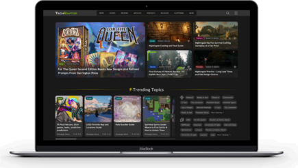
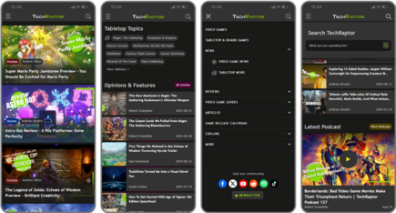
Landing Page Redesign for Gaming review platform TechRaptor
About the project
TechRaptor celebrated its 10th anniversary in 2023 as a go-to site for gamers to get news, reviews, interviews, and guides to both video and tabletop games. With a staff of over 10 devoted writers, Rutledge Daugette, the founder and leader of the TechRaptor team, approached iTech4Web with several goals for the homepage and primary landing pages of his Drupal website.
Initially scoped to be a homepage redesign, the project had several goals:
- surface a greater amount of content on the homepage
- organize the content in a more logical way to help visitors hone in on the content that interests them
- create a backend UI that allows his team of editors and writers to not just surface new content, but also easily rearrange homepage sections to reflect up-to-date thematic goals (such as a new release).
What we did
iTech4Web brought a top-down design strategy to the project, segregating the content first into two categories — video and tabletop games — and created easily understood visual icons to tag each category. Then, each different type of content within a category (such as News, Guides, Reviews, Opinions, etc.) was tagged and color-coded to achieve an instantly recognizable matrix of content.
With a just-right (not too complex) content taxonomy in place, the development of a Component-based Design for the homepage got underway. Using two Drupal modules, Layout Builder and Entityqueue, iTech4Web created a custom solution for TechRaptor’s homepage that allows Rutledge and his editing team to easily and visually create and style content blocks for various areas of the homepage. These content blocks can then be placed on the homepage as the editing team sees fit, and rearranged seasonally or as special thematic events arise. Rutledge was impressed saying “I was pleasantly surprised at how easily Drupal’s component-based solution can be utilized by my staff.”
When Rutledge saw how effective the Component-based Design was on the homepage, he wanted to have that capability for other landing pages as well, but that wasn’t in the scope of work for the project. Without significant modification to the project budget, the iTech4Web team figured out how to extend their solution, enabling the TechRaptor team to use the Component-based Design solution on the landing pages as well. “We love the flexibility Drupal gives us to cost-effectively serve our client’s needs,” says Dima Storozhuk, the founder of iTech4Web, “even when they don’t know exactly what they need at the beginning of the project.”
New features implemented:
Enhanced Content Visibility and Organization
- Content Categorization: Integrated a dual-category system for video games and tabletop games, each represented by customized visual icons.
- Content Tagging System: Established a color-coded tagging scheme for various content types (News, Guides, Reviews, Opinions) to simplify user navigation and improve engagement.
Drupal Implementations for Dynamic Management
- Component-Based Homepage Design: Implemented using Drupal's Layout Builder and Entityqueue, allowing for the flexible creation and styling of content blocks.
- Editorial Flexibility: Provided the editorial team with the tools to dynamically arrange and rearrange content blocks on the homepage, facilitating real-time content management in response to current events or thematic focuses.
Extension of Component-Based Design
- Landing Page Adaptation: Expanded the component-based design to other primary landing pages, enhancing site-wide consistency and usability without exceeding the initial budget.

